Mary Poster Rough

This is how the promo image we posted a little while ago started.  I really like the colors on the rough for some reason.  Maybe it’s the 3D thing. 

Ballyhoo Promo Image

Banner Rough

Also, while I was in Portland for Wizard World I was interviewed by Dylan at PSU.tv and give Ballyhoo a quick mention at the end.

My bit starts at 9:46Check it out:

Ballyhoo Process— Page 9, Making the art BIGGER

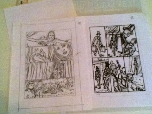
When starting a page, I usually do a thumbnail, blow it up and then lightbox the enlargement for the rough.  This is where I start to correct proportions and adjust the art and lettering to fit the page a bit better.  Also, as seen in panel one, if the thumbnail stinks, I’ll redraw the art. 

Image

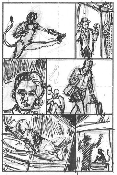
In the roughs, you’ll notice pencil over some blue lines.  The blue goes down first as I lightbox the thumbs to the larger size.  I then go over these in pencil.  You may also notice the red line in the last panel.  I’ve been doing the second pass in red to separate the blue from the red easier in the computer.  This also works if you’d like or need to take a third pass, usually with a black colored pencil or marker.  Again, I can just key out the blue and the red in the computer leaving the cleanest dark lines.

Image

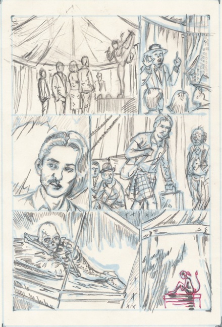
Even after these two steps I’ll still enlarge the art up to its “original” size for the “final” art.  I put these terms in quotes in because even after that stage the artwork goes through an extensive amount of digital processing, color art, lettering and production work to get the page ready for print.


Link

Ballyhoo on Pinterest

I’ve started a Pinterest board for Ballyhoo. 

I still get looks from people when I tell them I’m on Pinterest.  Looks that read to me like they’re thinking, “I didn’t think this guy was gay…” and they’re trying to reassess how they feel about me know that they know.

Well screw that noise, son!  Pinterest works better that google image search a LOT of the time.  Check it out.  http://pinterest.com/davidbeyerjr/ballyhoo/

Reference

Hi everyone, David here.  To keep things simple/ organized I’ll be posting in this nice dark blue color. 

Ballyhoo has such a great amount of interesting visuals built into the story by virtue of it’s time period, it’s location and the characters.  It’s mostly set in the fifties at the circus, and the lead characters are “freaks”. 

The thing about doing a period piece is that I can’t just do research on the circus and call it a day.

As I was looking for some general 1950’s things I came across this sweet picture from the Milwaukee Public Library.  A classic Bookmobile with a bunch of excited kids ready to check out some books.  The same kids who, with a change of setting, would be just as (if not more) excited about a day at the Collins Bros. Circus. 

Bookmobile in Milwaukee

Date: 1956- Courtesy of MPL

Bookmobile